
Design Tips For An Effective Outdoor Business Sign
It’s important to remember old advertising techniques. Paying for airtime on the local radio station, buying up space in a newspaper, or even telling friends and strangers about your business are all traditional marketing technique. One of the most effective marketing strategies is outdoor signage. To improve their profits, any business owner should know these design tips for an effective outdoor business sign.
Know the Location:
Sign placement is essential for successfully promoting your business. You want your sign to stand out from its surroundings. You should aim for optimum exposure. To do this, place your sign in a location people frequent. This might be near a road or path, for example. Still, make sure your sign is not placed too high or too low where people can miss it.
Keep Size in Mind:
Size does matter—larger letters mean easier readability from a distance. This is especially important for roadside signs or signs in high places. Simply put: visibility is legibility. Another important tip is that less is more. Don’t clutter your sign with letters and symbols. The more precise your message is, the stronger it comes across to readers.
Choose Impactful Colors:
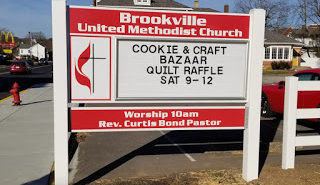
A powerful color scheme can make your sign stand out from the rest. As humans, different colors give us different physiological and psychological responses. Orange, yellow, and red give a stimulating response. Blue, green, and purple are less stimulating and give a soothing response. Keep this in mind when picking colors for your sign. Make sure to choose contrasting colors to make your message stand out.
Ensure Readability:
Your message’s typeface, font, and overall readability is the most important part of effective signage. You want a crisp, easy-to-read message that customers will remember. Feel free to use different styles, such as italics or boldface, to get your message across. Also, don’t feel like you must use all capitalized letters for your message. Contrary to popular belief, this does not improve its readability. Using all capital letters can be overwhelming and off-putting. Using both capitalized and lowercase letters in your message give the best readability up close and at a distance. Another important note is to not use two different fonts in one sign. While it might look creative and make your sign stand out, two different fonts make your sign harder to read. Keeping your message clear and easy-to-read is ideal for customer satisfaction.
Add Graphics:
Finally, the design and graphics are the last piece to make your sign stand above the rest. You should use your company symbol on your sign to maximize brand awareness. Graphics add visual interest and improve reader attention. In this case, it’s better to underuse graphics than to overuse them. You don’t want to make your sign difficult to read.
Here at EZ Signs Online, we make it our mission to provide the best custom outdoor business signs. Check out our product selection for your small business or community building.